Powered by  翻訳
翻訳
翻訳
アーティスト・作品
ブルーノ・マーズ
プロフィール
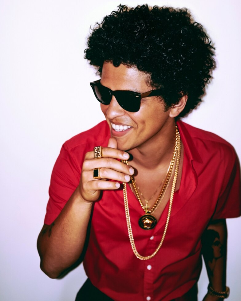
ブルーノ・マーズ
出身 :ハワイ州ホノルル(父:プエルトリコ系アメリカ人 母:フィリピン人)
生年月日 :1985年10月8日
ブルーノ・マーズはグラミー賞で21部門にノミネート、そして4部門を受賞した輝かしい功績を持つ。シンガー、ソングライター、プロデューサーとして偉大な才能を発揮し、ブルーノ・マーズは世界中で1億7,000万枚のシングルセールスを達成し、名実ともにトップアーティストとしての立ち位置を確立。
最新アルバムの「24K Magic」はリリースして間もなく“プラチナ”アルバムセールスを達成。 トップデジタルアルバムと、R&B/HIP-HOPアルバムチャートで1位を獲得。「24K Magic」は、iTunes総合チャートとシングルチャート両方で初週同時1位を獲得。ビルボードHot100でも4位を獲得し、正式に“プラチナ”シングルとして認定された。
ブルーノの最新シングル「That's What Like?」はビルボードHot100で1位になり、14週連続トップ10にチャートイン、Hot R&B Songsチャートでも初週に1位を記録。ブルーノが「Nothin' On You」で自身初のビルボードHot100の1位を獲得して以来、7年ぶりの1位達成を成し遂げた。
ブルーノは、過去リリースした3枚のスタジオアルバムからシングルカットされた曲で全米1位を獲得しており、さらにその曲が自身によるプロデュース作品であることは非常に稀なことである。
ビルボード1位を7曲獲得した偉業は、エルビス・プレスリー、フィル・コリンズ、フランキー・ヴェリーと肩を並べる大記録となっている。 また、ここ10年でも男性ソロアーティストとしての1位獲得回数はジャスティン・ビーバー、ドレイク、エミネム、そしてウィークエンドなど錚々たるアーティストをしのいでの記録達成となっている。 ビルボードシングルチャートで1位を5回獲得した最年少記録はエルヴィス・プレスリー以来の歴史を塗り替える形となった。
現在、ブルーノは1日で100万枚以上のチケットセールスを記録した大規模な世界ツアー“24K Magic World Tour”を回っている。
また、2015年にはシングル「Uptown Funk」が世界中のチャートを席巻し、この大ヒットは、ビルボードHot100シングルで14週1位を達成。2010年代で最長のチャートイン記録となっており、さらに57年の歴史の中でも10番目に長くチャートインしたシングルとなった。
この「Uptown Funk」は、グラミー賞で“the coveted Record of the Year”の受賞を含む3冠を獲得した。
2016年2月には、第50回スーパーボウルのハーフタイムショーでビヨンセとコールドプレイと共演。これは2度目の出演で、 前回の2014年のパフォーマンスは最年少出場記録であり、さらに視聴者総数1億1,530万人というNFL歴史上最多の記録を樹立している。
歌手、ソングライター、プロデューサーとして、ブルーノ・マーズは全米総合チャートにすでに36曲ものヒット曲を送り込んでいる。まさに名実ともに世界をリードしているヒットメーカーである。
グラミー賞受賞暦
第53回 最優秀ポップ・男性ボーカル・パフォーマンス賞“Just the Way You Are”
第56回 最優秀ポップ・ボーカル・アルバム賞“Unorthodox Jukebox”
第58回 最優秀レコード賞“Uptown Funk/Mark Ronson ft. Bruno Mars” 最優秀ポップ・デュオ/グループ・パフォーマンス賞“Uptown Funk/Mark Ronson ft. Bruno Mars”
第60回 最優秀アルバム賞、最優秀レコード賞、最優秀R&Bアルバム賞"24K Magic"
最優秀楽曲賞、最優秀R&Bソング賞、最優秀R&Bパフォーマンス賞"That's What I Like"
問合せ窓口:
エイベックス株式会社
インターナショナル事業本部
[email protected]