24 Best Websites (Examples) 2026
We’ve been asked multiple times to create a list of the best websitesso here you go.
It took us multiple weeks to examine 200+ pages to curate a collection of the greatest 25.
Instead of assembling a bunch of websiteswe carefully analyzed and examined each. We also broke them down into five of the most common categorieswhich you can navigate by clicking the links below.
This post covers:
- Best Business Websites
- Best eCommerce Websites
- Best Personal Websites
- Best Blog Websites
- Best Agency & Startup Websites
In additionwe made sure to include as varied designs as possible—from simplistic ones to more complicated ones—you get them all and then some.
If you’re ready to take action and want to build a similar websiteyou can easily do it with a popular WordPress theme or a business website builder.
Best Business Websites
1. Notarize
Built with: Webflow
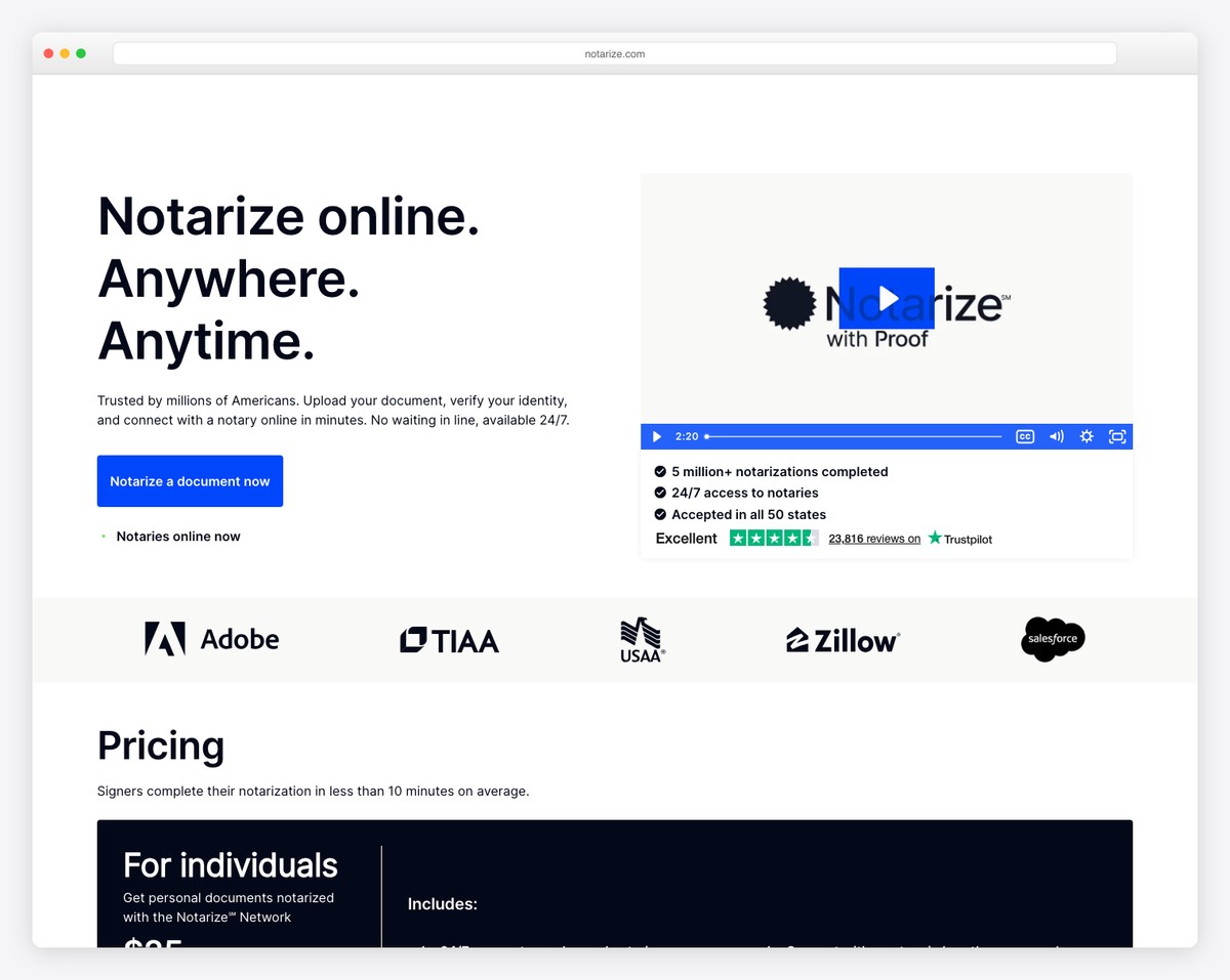
Notarize is an excellent business site with a modern look and a terrific scrolling experience. This notary website has a top bar notification with sliding texta sticky header with drop-down navigation and a client testimonial grid.
Notary uses accordions for FAQs and displays multiple quick linkssocial icons and call-to-action buttons for app download in the footer.
What stands out: Adding a floating header/menu can improve your Webflow website‘s user experience.
2. Objective
Built with: Wix

Objective is a clean and creative website example with an animated hero section and a unique overlayed and sticky “objective” text that works as a back-to-top button.
The header and the footer are minimalist with the essential linkssocial mediaeCommerce icons and newsletter subscription form.
What stands out: A clean design with unique details works great for a life brand.
Take a peek at these fantastic websites built on the Wix platform for more inspiration.
3. Casa Mami
Built with: Squarespace
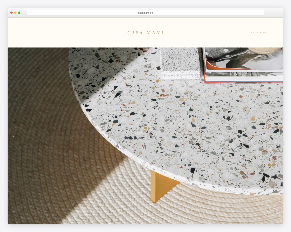
Casa Mami is a minimalist website with a massive image slider above the fold that lets you enjoy the location – without overlayed text or CTAs.
The page also uses plenty of white spacea parallax imageand a basic header and footer.
What stands out: Create a slideshow that will trigger everyone’s interest (without including any sales elements).
Don’t forget to view our exclusive list of the greatest Squarespace website examples.
Best eCommerce Websites
4. ETQ
Built with: Shopify
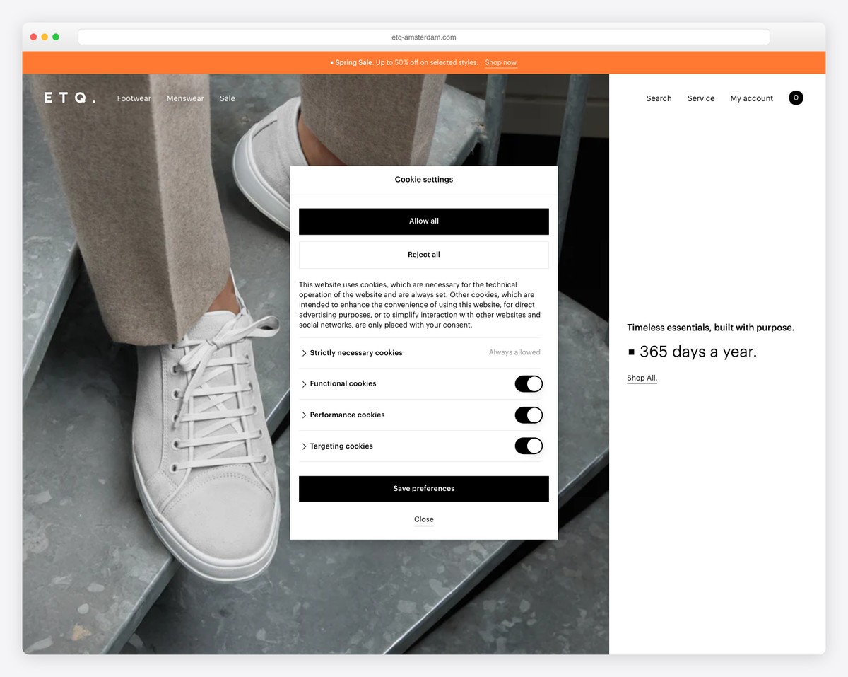
ETQ is a beautiful shoe website with a minimalist design and a quick popup that takes you directly to one of their products.
The header is transparentwith only the basic menu links to keep it cleaner. Alsoit disappears when you scroll down but reappears when you scroll back to the top.
On the other handthe footer features multiple columns with plenty of quick linksbusiness detailssocial media and a newsletter subscription form.
What stands out: Clean and simple site design can make your products (and services) pop more.
You must look at these best Shopify websites if you’re also building an online store.
5. Feastables
Built with: Shopify
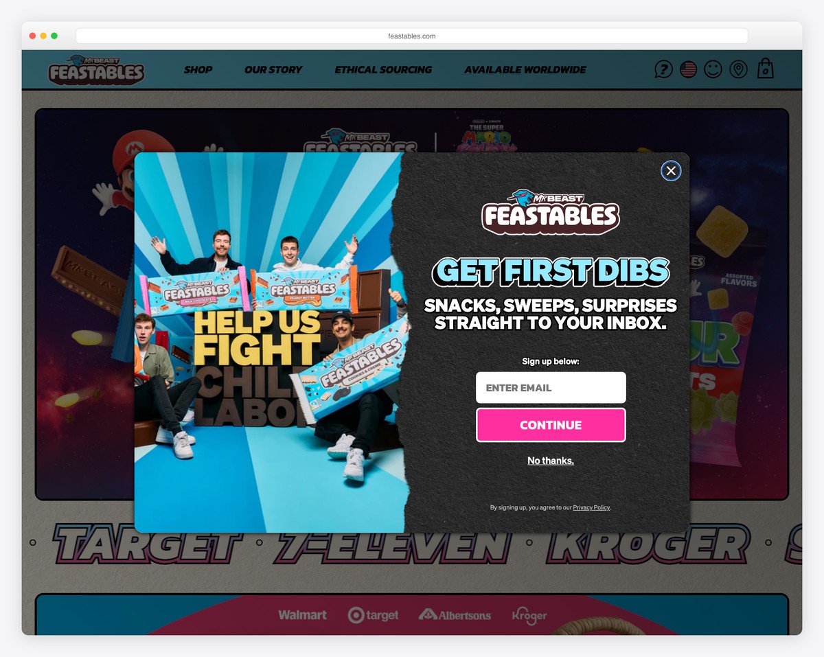
Feastables is one of the more unique eCommerce website examples with plenty of cool elements and special effects. It even gives you a chance to play a game!
It has a top bar with sliding text notification and a drop-down menu that helps get to the right products or info.
The navbar also has a play button to listen to the Feastables theme song while enjoying the site’s content.
What stands out: There’s no right or wrong approach to responsive web design – go against the grainlike Feastables!
6. Oatly
Built with: Shopify
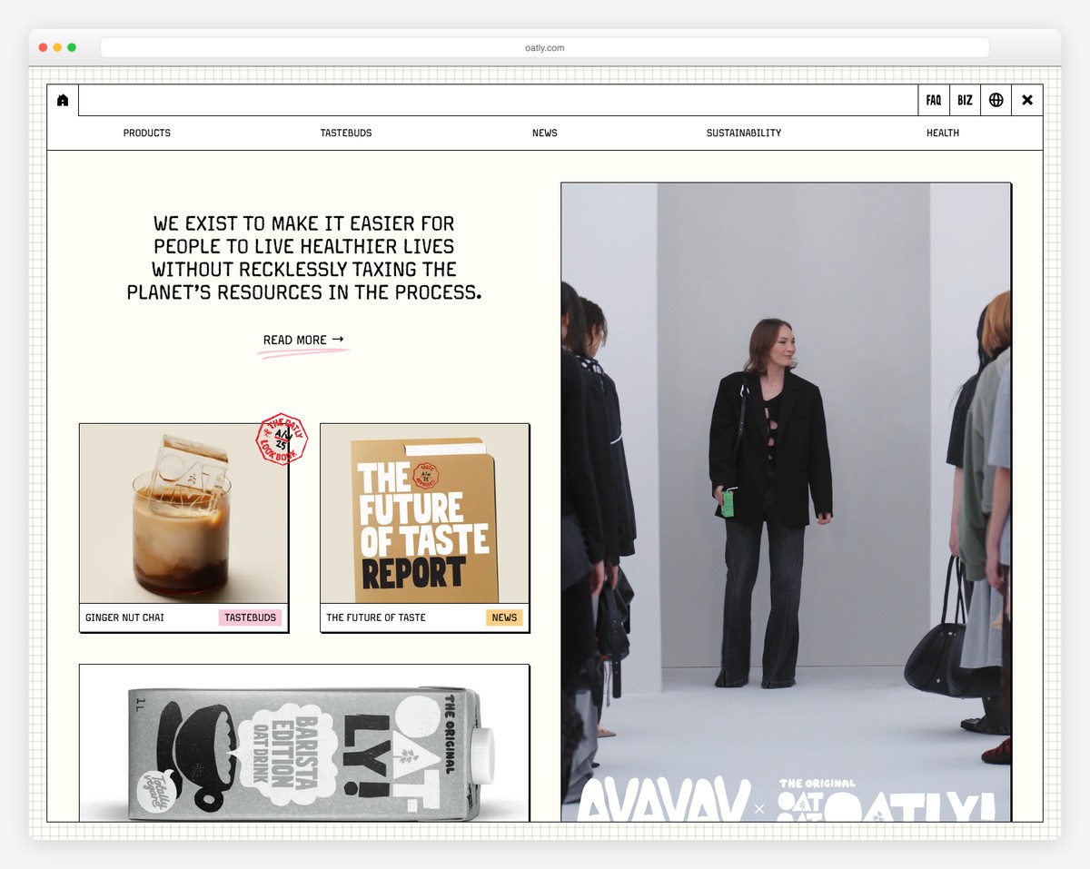
Oatly’s home page has an original look with horizontal scrolling instead of vertical. It’s super crowdedbut the cool graphicsbold text and other catchy elements make it enjoyable to skim through.
The front page doesn’t have a footeronly a header with a hamburger menu iconaccount button and shopping cart icon.
Oatly has full-screen navigation with drop-down/mega menu functionality and a language selector.
What stands out: Instead of rocking a website with traditionalvertical scrollingmake it scroll horizontally.
7. Huel
Built with: Shopify
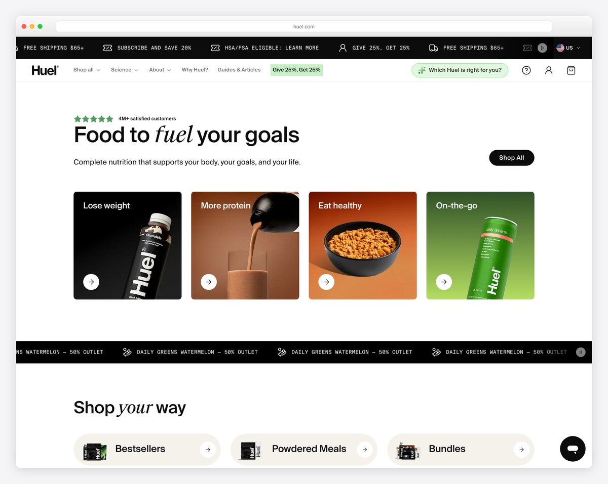
Huel is a moderncontent-rich website example from which any eCommerce business can learn.
It has a location selector notification above the navigation barboth sticking to the top of the screenso all other pages and categories are only a click away.
MoreoverHuel also features a sticky bottom bar notification they use for collecting emails. But you can close the top (then a permanent notification appears) and the bottom bar if you don’t want distractions.
What stands out: Use top and bottom screen notification bars for country selectionsubscriptionsspecial announcementsetc.
8. P&Co
Built with: Shopify
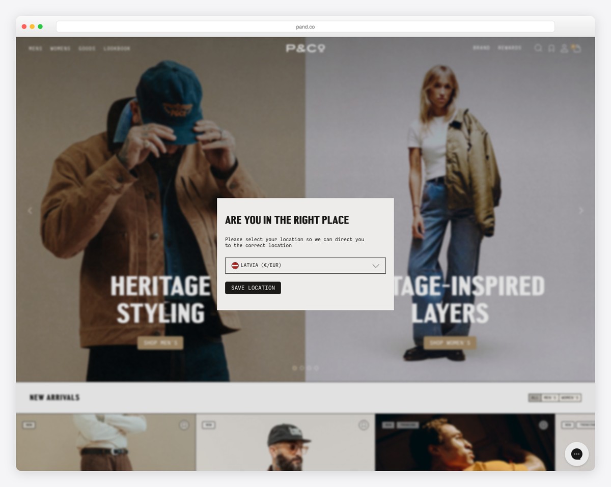
P&Co is a clean website example with a floating header and a full-width slider that promotes their new dropsdealsand more.
The website also features two carousels for new arrivals and featured products so that you can enjoy a quick overview.
Moreoverthere’s also a live chat widget in the bottom right cornerwhich contributes to better customer service.
What stands out: Answer all your potential customers’ questions quickly via a live chat integration.
Best Personal Websites
9. Anthony Wiktor
Built with: Gatsby
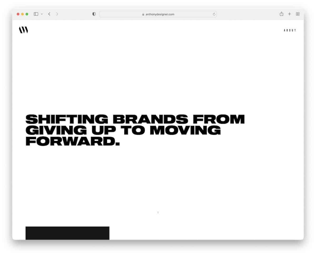
While Anthony Wiktor’s personal website looks pretty simple and basic at first glanceit’s far from it once you start scrolling.
It all begins with a strong message on a white background that turns dark once you start scrolling. Next is a portfolio grid of projects with an impactful hover effect.
Furthermorethe header and the footer are clean to maintain an awesome appearance.
What stands out: Minimalism and animations can significantly elevate the user experience.
10. Sean Halpin
Built with: GitHub Pages
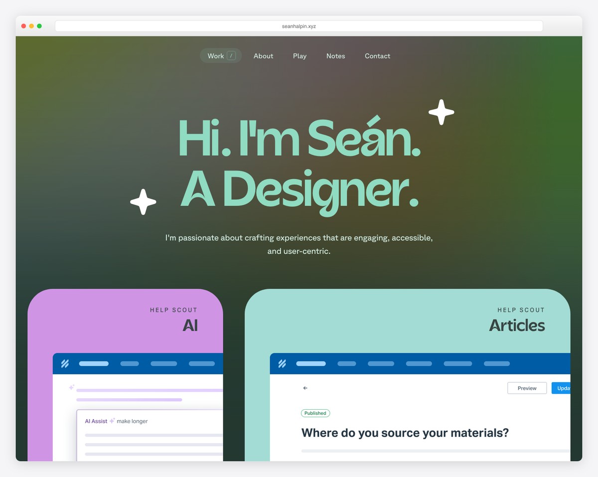
The “starring” eyeespecially in the header that follows your mouse cursoris a fantastic detail of Sean Halpin’s website.
The page has many creative elements that ensure a pleasant browsing experiencewith a live chatbot widget in the bottom right corner.
What’s pretty awesome is that even when you press the contact link in the navbarthe chat openswhich you can use to get in touch with Sean (there is no traditional contact form).
What stands out: Add engaging little details and elements for a fun experience.
11. Devon Stank
Built with: Squarespace
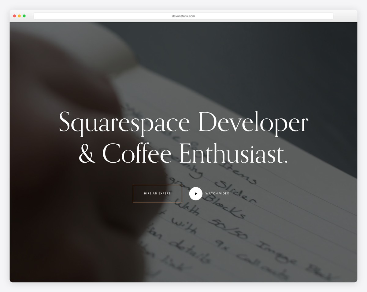
Devon Stank triggers everyone’s interest with a full-screen video background above the fold. You can act by clicking the “hire” button or the play buttonwhich opens a lightbox video.
This developer portfolio‘s design is darkgiving it a more premium feel. Before the footeryou’ll find a simplistic Instagram feed that opens posts on a new page.
What stands out: Introduce more quality content to your website via an IG feed (and use it to grow your profile).
12. Arlen McCluskey
Built with: Webflow
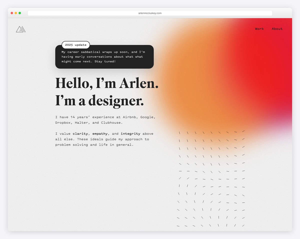
Arlen McCluskey is a stunning portfolio website with a vivid gradient background to spice things up. The hero section only has text to learn more about Arlen quickly.
We like the home page portfolio with actual (animated) presentations the most. Howeveryou can also click on each project to view a more in-depth presentationwhere Arlen shares all the ins and outs.
Finallythe header and the footer are plain and minimalistcomplementing the base nicely.
What stands out: Integrate screenshot videos/GIFs to showcase your works instead of just static images.
13. Mindy Nguyen
Built with: Squarespace
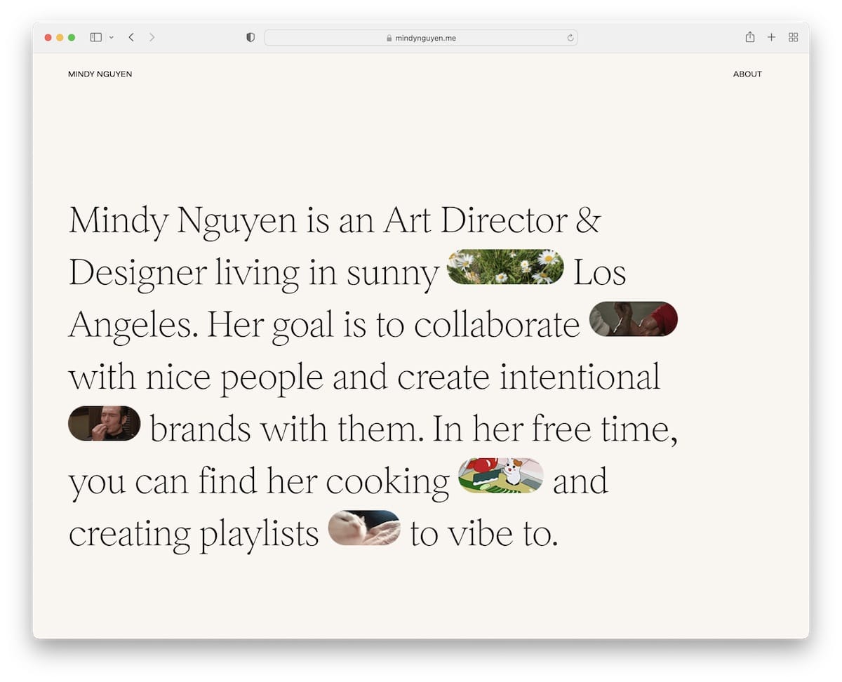
Mindy Nguyen’s short bio above the foldcombined with catchy GIFssparks curiosity. It’s simple but captivating.
The header and the footer don’t separate from the basekeeping the same background color for a more pristine display.
The home page also contains multiple projects with links to live exampleswhich is perfect for boosting social proof.
What stands out: Mix text with emojis and GIFs to make it more entertaining.
Best Blog Websites
14. Urban Beardsman
Built with: Shopify
Urban Beardsman has a fascinating blog structure with a split-screen design (on desktop)where the left part is sticky and the right part is scrollable. The right part also has a split designwith the date and title on the left and the featured image on the right.
The website also has a disappearing/reappearing headerwhich reacts depending on whether you scroll down or up.
What stands out: Feel free to copy (and tweak) Urban Beardsman’s split-screen blog layout.
15. Zion Adventure Photog
Built with: Wix
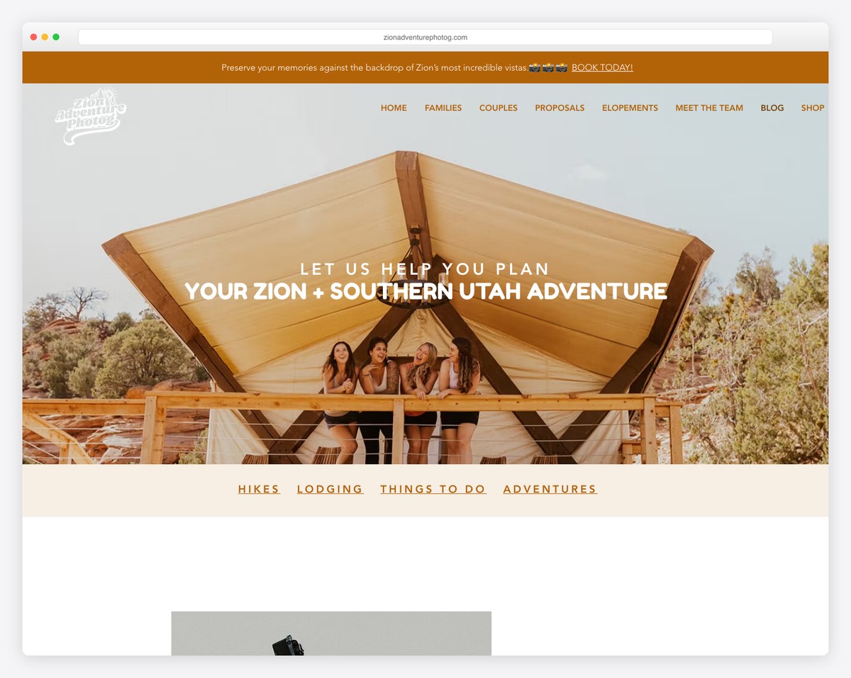
Zion Adventure Photog has a banner with a parallax imagea top bar notification and a transparent navigation bar.
A popup will appear a few seconds after the website loads offering you a free travel guide in exchange for your email.
The footer has a bold design with menu linkssocial iconsa contact CTA button and a newsletter subscription form (for the same free guide as the popup).
What stands out: A parallax image effect can enrich your website’s designmaking it livelier.
16. The Good Trade
Built with: Squarespace
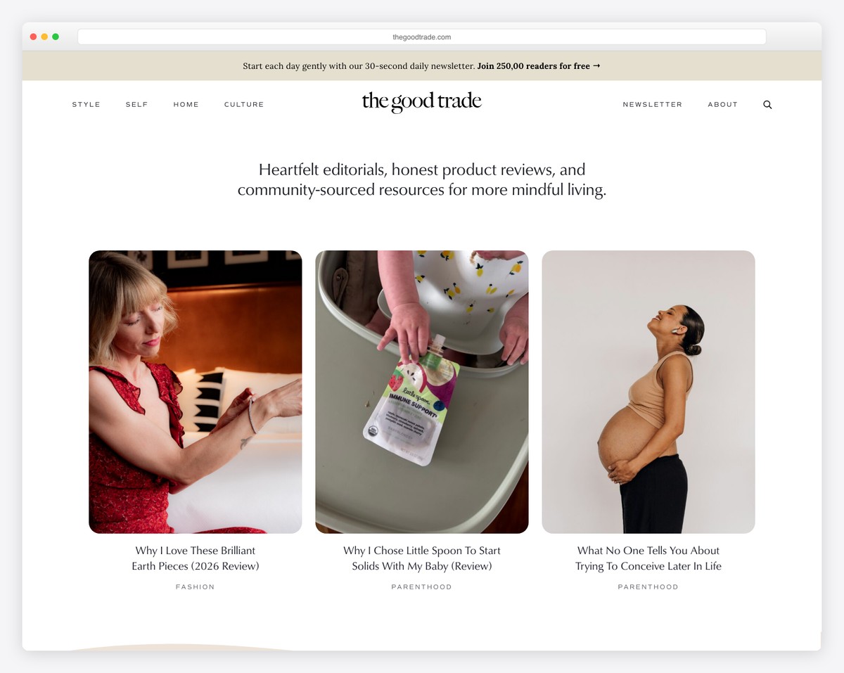
The Good Trade has a minimalist floating header with a drop-down menu and a search icon that opens the bar on a new page with a newsletter-rich footer.
In additionthe hero section showcases three featured blog postswhile the base has multiple carousels containing other must-read articles.
Right below the fold is also a newsletter subscription widget for a higher chance of scoring even more leads.
What stands out: Use the above-the-fold area to promote your new or most popular blog posts.
17. Cookie And Kate
Built with: Magazine Pro Theme
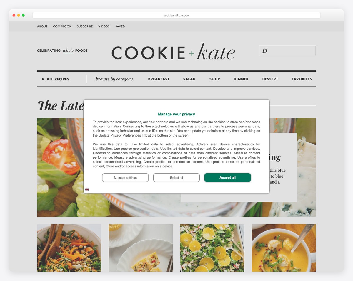
Cookie And Kate’s header takes a pretty large chunk of the websiteemphasizing the logo. It also has a top bar with quick links and a multi-level drop-down menu for finding recipes and other content more easily.
This blog has a right sidebar rich with handy widgets and a sticky banner ad. What’s also unique is the extensive excerpt each blog post hasincluding two images on average.
What stands out: Make banner ads stick to the screen to enjoy more clicks.
18. Pando
Built with: Webflow
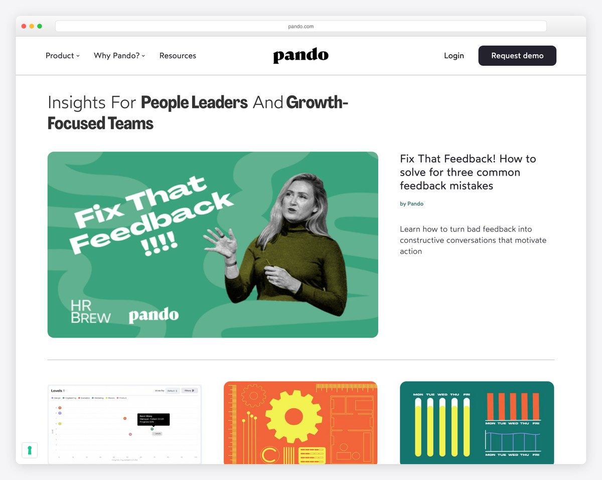
Pando is a blog with a single-column post layout and no sidebars. Each row features a featured image on the left and a titleexcerptdate and author(s) on the right.
The header is basicwith a CTA buttonwhile the footer provides a few additional links and contact details.
Besidesa small popup for subscription launches in the bottom left corner after a few secondsbut the live chat widget is present from the beginning (in the bottom right corner).
What stands out: Collect more emails and grow your list with a popup.
Best Agency & Startup Websites
19. MinRims
Built with: Webflow
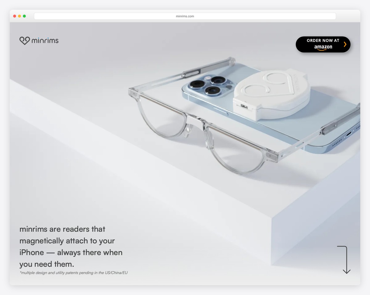
MinRims’s one-page website scrolling experience is very enticing and creates a fantastic product presentation. It excites the viewer to click the CTA button at the end or in the sticky header.
Whether you click on the “join the waitlist” or the “customer service” buttona popup opens with a corresponding form to submit the details without leaving the current page.
What stands out: Create a single-page layout for an epic presentation of a single product.
20. Bain & Company
Built with: Gatsby
Bain & Company’s home page is content-richenhanced with a massive image slider above the foldan embedded video and a floating headerso all the menu links and search bar are always accessible.
It also has a top bar with links to officesadditional quick linksa regionand a language selector.
Note: Add a top bar to display additional information or links and keep the header cleaner.
21. Consolto
Built with: Webflow

Consolto has a captivatinglanding-page- home pagewith strategic CTA button placements that contribute to more conversions.
The header reappears on a back scroll for better UXwhile the floating chat widget improves customer service.
Plusdifferent animations and hover effects call for more engagement and the use of white space for better readability.
What stands out: Scatter CTA buttons across your website to improve click-throughs (preferably using contrasting colors to make them pop more).
22. KeyNest
Built with: Squarespace
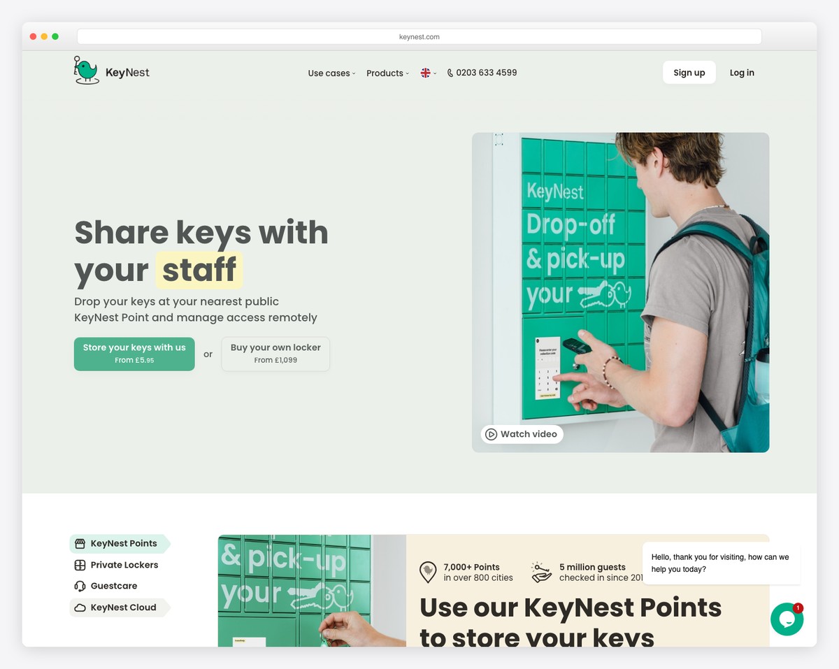
KeyNest is a modern startup website with a search bar in the hero section. Howeveranyone new to the service can also click the “watch how it works” linkwhich opens a lightbox video.
The transparent header has a drop-down menua clickable phone numberaccount buttons and a language selector.
We also like the testimonial slider that combines FacebookTrustpilot and video testimonials.
What stands out: Give your search function all the shine it needs by adding it to the hero section.
23. Passionfroot
Built with: Squarespace
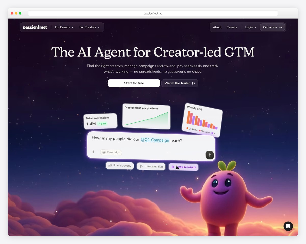
Passionfroot’s website stands out with a dreamy gradient hero in deep purple and pinkfeaturing their friendly mascot character. The messaging is crystal clear — “The AI Agent for Creator-led GTM” — with dual CTAs for free signup and a product trailer.
The dashboard preview below the hero immediately demonstrates the product’s value with real metrics (1.4M impressionsengagement charts). The design perfectly balances playfulness with professionalism.
What stands out: A branded mascot character paired with a product preview screenshot can make a SaaS landing page both memorable and informative.
24. Toad Bakery
Built with: Squarespace
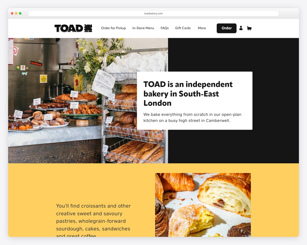
Toad Bakery’s website is a masterclass in small business web design. The split-layout hero combines an inviting behind-the-counter photo with a clean introduction cardwhile the yellow accent sections add warmth and energy.
The navigation is practical (Order for PickupIn-Store MenuFAQsGift Cards) and the overall design captures the warmth of visiting a neighborhood bakery — all built beautifully on Squarespace.
What stands out: A warmwelcoming website design that mirrors the in-person experience can drive foot traffic for local businesses.

Related Posts


Comments (0)